September 6th, 2015
If you have some background in journalism or mass-media communication you probably heard about the popular rule of the 5 wh-questions: any news story should provide an answer to the questions “who?”, “what?”, “why?”, “when?” and “where?”. But you may not know that such rule was taken from Cicero’s De Inventione, a kind of handbook for orators containing lots of hints on how to do a public speech in the 1st Century BC.
In particular, Cicero wrote that any good speech should contain a set of 6 properties used to determine the completeness of the exposition (expositio). These properties, or loci, and their relative questions, represent a classical principle of rhetoric that can be very useful for evaluating a website in all its aspects, too. It may be surprising, but any website in 2015 can be not so distant – as a communication process – from a speech in the ancient Roman Senate.
- QVIS (Who?) » IDENTITY
- QVID (What?) » CONTENT
- CVR (Why?) » SERVICES
- VBI (Where?) » LOCATION
- QVANDO (When?) » MANAGEMENT
- QVOMODO (How?) » USABILITY
This is the so-called 2QCV2Q Model, from the initial letters of the Ciceronian loci on which it is based, originally developed by L. Mich and M. Franch at University of Trento (Italy). It’s based on the fact that the design of a website, too, can be viewed as a series of answers to the question contained in Cicero’s rule. In fact, the original model identifies a set of evaluation elements for each of the 6 properties and the resulting checklist has 4 important features:
- it is general, so that it can be applied to any kind of website (corporate, ecommerce, individual portfolios, blogs, etc.)
- it is domain independent, meaning that it can be easily applied, for example, to the tourist sector as to non-profit organisations, to the automobile sector as to the public administration.
- it is easy to use, in fact it does not require highly specialised expertise, neither from a technical nor from a marketing/creative standpoint.
- it is robust, meaning that it contains all the basic elements needed to guarantee the quality of a website.
The following presentation sums up the whole methodology. Note that I updated the evaluation elements in order to include some modern principles of web design and UX that were not present when the original model was created.
Share:
Facebook,
Twitter,
LinkedIn
· Tags: project management, slideshare, ux, web design
November 30th, 2014
The search box is one of the most popular topics in web design: you can find tons of posts and articles discussing on how the perfect search form has to be designed. That’s beacause anyone working in the digital field knows the importance of search in the general user experience of any website, especially for e-commerce and other premium services where a poor search experience can cost money.
In this post I’ll try to write down some quick notes on search box UX state of the art in A.D. 2014, with a focus on 9 aspects that in my opinion can make the difference in any situation. I’ll start with the basics, then I’ll add some points with most advanced features and new best practices.
1. Choose The Right Position
I can bother you with long articles and researches on this specific issue… But I won’t. Just take a look to the chart below, taken from a study by A. Dawn Shaikh and Keisi Lenz: it shows the expected position of the site search form in a survey with 142 participants.
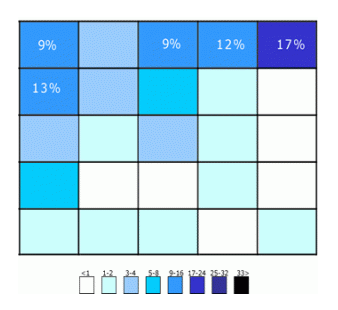
So place that search box in the upper right area of your layout and you’ll be sure that your users will find it where they expect it to be.
2. Put The Search Button To The Right Of Its Input
This is quite a simple rule: you don’t have to be too creative when designing a search box. Users are accustomed to UX conventions like this one and, when those conventions are adhered to, they can understand quickly your website interface and operate more easily on it. For this reason, an example like the first one below is wrong.
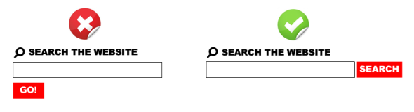
Bonus Tip: the left example is wrong also for the button label “Go!”. A button named “Search” (or with an equivalent icon) identifies more clearly and more immediately the scope of the form.
3. Do Not Add Unnecessary Stuff
Basically, a search form should only consist of a text input and a button next to it. You won’t need anything else. In particular, displaying preset phrases inside the search field (for example “Type your search here”) is something really useless: anyone knows how to use a well designed search form and you should not create over-complication to it. See the example below, taken from Nielsen Norman Group’s website.

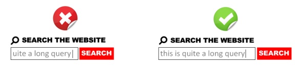
4. Make Room Enough For 27-Characters Queries
On its 2006’s study “Prioritizing Web Usability“, usability-guru Jakob Nielsen analyzed the length of search queries and discovered that most of search boxes are too short: of course you can type long queries, but only a portion of the text will be visible at a time and this means bad usability, since users cannot review and edit easily what they are writing.
Nielsen discovered that the average search box is 18-characters long and the 27% of queries were too long to fit into it. The best option is to have a 27-characters text input: it would accomodate 90% of queries.
5. Put The Search Box On Every Page
This is very simple and straighforward: you should always provide access to the search box because if your users cannot find the content that they are looking for, they will try to use your search regardless of where they are in your website.
6. Don’t Forget An “Autocomplete” Feature
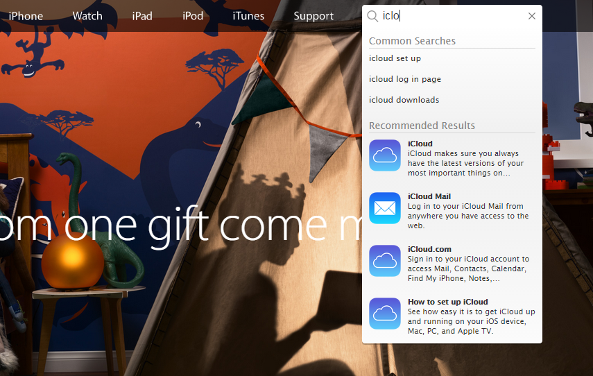
It’s very important to provide an asynchronous autocomplete (or autosuggest) feature that helps user to quickly select relevant queries while he’s still typing. In terms of UI, you can see one of my favorites on Apple.com:

Some notes on why Apple’s search autosuggest is well done:
- It provides both popular searches and recommended results. Popular searches offer an important help to the user (see next point).
- Clicking on a recommended result brings directly to the detail page for that specific item, bypassing the search results page.
- The thumbnail images are lovely and help improving general UX with a more immediate recognition of recommended items. This is crucial for e-commerce.
- It’s fast. You can see the suggestions appearing basically in real-time as you type. This is maybe the most important aspect to take into consideration when developing a search autocomplete and, if missing, it can nullify all the good things you made on the three previous bullets.
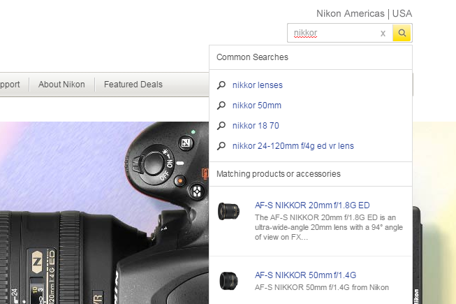
7. Display The Most Popular Queries
Displaying the most popular queries can be a great help to the user. This can be done inside the autosuggest dropdown menu, like in the previous example from Apple.com or the following from NikonUSA.com:
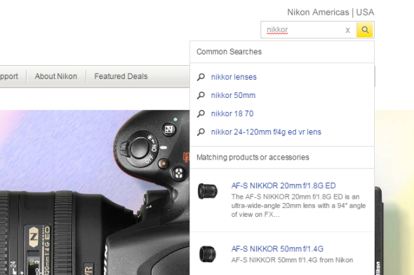
Note that the list of common searches should only contain valid queries, filtering anything non relevant (duplicate queries, mispelled queries, no-result queries).
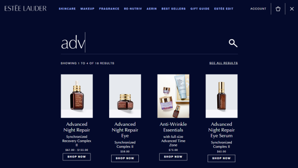
Another way for displaying popular search is to show them as a default suggestion when users access the search form, like EstéeLauder.com does:

This is much more focused on marketing than on UX, but can be a quick and simple solution for going live with this feature without too much technical effort: having a human being that periodically checks internal search stats (for example on Google Analytics) and creates a list of the top 5 queries will be enough.
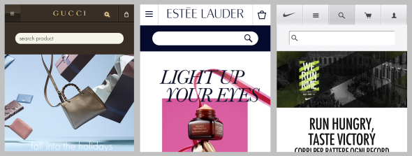
8. Be Prominent On Mobile
We are in 2014 and you should always put great attention on how your website behave on mobile devices. Regarding the search box, it doesn’t matter if you have a mobile-specific website or a responsive layout: what’s important is to keep search prominent in the design.
Look at the following examples from Gucci‘s, Nike‘s and Estée Lauder‘s mobile sites: search is always well visible on top of the layout.
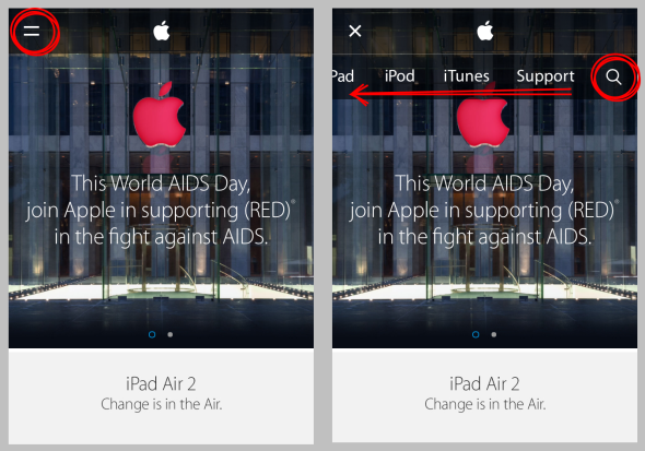
Apple’s mobile website does wrong in this case (actually they are anything but a best practice in terms of responsive design): you have to access the menu clicking on the top-left corner, then swipe horizontally the menu items in order to see the search icon on the right.
9. Make Search An Immersive Experience
This is quite a new trend and I love it. With a touch of HTML5, CSS3 and JS is now quite easy to create amazing transitions when the search input is on focus, making it really big and creating a full-screen immersive search experience. One of the best examples on this point is again EstéeLauder.com:
But my favorite template if you are starting from scrath is Morphing Search (from Codrops): with a smooth transition, it turns a standard search input into this beautifully-designed full-screen rich interface with suggestions and filters:
Note that this is only a frontend experiment, but it’s a very good template if you are looking for an inspiration on how to create a rich, usable and visually beautiful interface for internal search on your next project.
Share:
Facebook,
Twitter,
LinkedIn
· Tags: search box, tips, ux, web design


 I consider myself a WordPress evangelist, but for a long time I hadn't found a reason to install that glorious content platform on my good old website. Now that shame has ended. In this blog I want to share some interesting stuff about topics I love, such as UX design, digital project management and anything else I'd like to write about.